Hand & Stone Massage Booking optimizations
Health & Wellness Industry | User Task Testing
Overview
Hand and Stone Massage Spa wanted to increase the number of appointments booked on their website across their franchises, however a high percentage of users were dropping off in the online booking process and calling.
My role was determining the pain points in the online booking process through user task testing in Lookback.
When users came to book their day at the spa, there were an overwhelming amount of places to start and options to choose from on the homepage. As users made their way through the booking process they came across a range of pain points, leading them to leave the site and call to book instead. This resulted in an unmanageable amount of calls to different franchises. Since there wasn’t a single drop off point determined in the booking process, I determined that task testing would be the most efficient way to determine where each pain point was in the users’ journeys.
User task testing
I recruited six users through my network and took them through a series of tasks on both desktop (3) and mobile (3) to determine where users were dropping off in the booking process. As users went through the following tasks, they were asked to vocalize their thoughts.
Where would you go to start booking a facial?
Please continue through the booking process as if you were scheduling an appointment. Once you reach the checkout, please wait.
Please return to the homepage.
How would you book a 90-minute massage?
User feedback
User feedback from the task testing aligned with the issue the business was experiencing, including comments like:
Why are there so many add on options?
They asked for my location and now they want me to create a login?
This is the point where I would just call.
Pain points
Common pain points from the exercise included:
Cluttered pages
Overwhelming amount of options
Not very intuitive flow of steps and when information was presented to users
Generally frustrating process
Solutions
To make the booking process more intuitive for users, the booking flow needed to remove as many barriers as possible including:
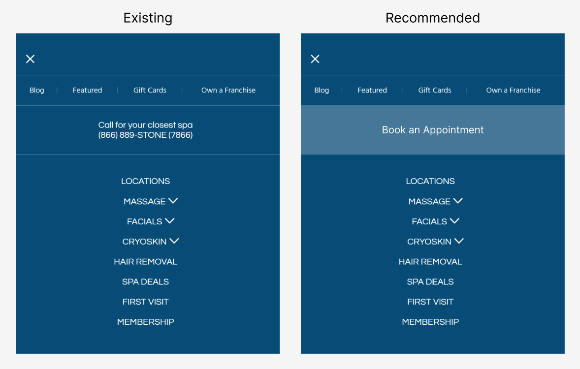
Decrease number of Book Appointment CTAs on the home screen to keep users focused
In general simplify design for a less cluttered feel
Automated location reading to remove extra steps in booking flow
Optional account creation
Login option in menu for return users
Prioritize only necessary selections in the process (deprioritize add ons)
Increase site speed/decrease screen load time
Recommended booking flow
Recommended desktop navigation
Recommended mobile experience
The simplified roadmap, along with recommendations on how to de-clutter the homepage and entry points to this flow were presented to the client for a third party implementation.


